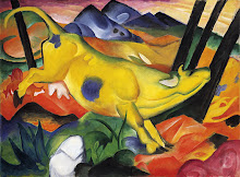
Well I'm not sure who the artist is or what the title of this painting is, but I absolutely LOVE it! The use of color is fantastic!
The painting is definitely non-representational, not meant to reflect any sense of reality. It really gives the viewer the opportunity to use their imagination and see whatever they want to in the image. The colors are vivid and bold, communicating energy and enlivening the otherwise drab canvas. The energy this painting puts off is very captivating. It agitates me, but at the same time it brightens my day. I am strangely reminded of a hot, summer’s day at the beach.
The artist used a darkened background with darker values of reds and browns, with splotches of black, to help highlight the designs in the foreground. The rich, hot hues of orange and red create that much
 more contrast for the hues of blue and purple to stand proud in. The painting seems very flat and fixed, yet the artist has applied overlapping to the different objects, perhaps in order to give some life to this strange world. In the lower-right, there is an archway that looks like it could almost be a walkway to go through in order to enter this unusual world.
There isn’t much evidence of implied lines being used to direct the viewer; however, the horizontal and vertical directions of the objects in the painting do draw the viewer to look more intently at the bottom, left quadrant of the painting. I think the artist preferred to use color saturation and intensity as opposed to implied lines to guide the viewer about the image. The brighter and more saturated the hues, the more the viewer is drawn to that area of the painting.
In my own interpretation, I’ve found something that really does interest me in this piece and makes me wish I knew the artist’s name so that I could see more of his or her work. What I find particularly interesting in this painting is the artist’s ability to make things really “pop” out. The complimentary use of colors adds to the affect of the objects being separate entities. Just by using vertical lines of blues, the artist has made both the orange and blue vertical lines seem to be at the very forefront of the world in this painting.


1 comment:
I really like the fact that you can point and and find a bunch of different shapes in the picture.
Post a Comment