Sunday, August 31, 2008

!!!JJ's First Slumber Party Adventures!!!

JJ, Iris, and Kaedyn had an absolute blast running Janessa and I ragged on Saturday night! We had a lot of fun with them but man oh man! Three kids under 16 months is not a task I want to tackle again! Here are some of their adventures!!!


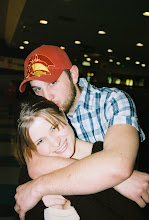
The dads went out to watch the UNR game for "guy bonding" (although there WAS one additional female who wasn't welcome by some.) As a result, the moms got the honor of watching the boys, as well as their girlfriend, Iris, who was being babysat for family friends. Now, if you've never given one toddler and two almost-toddlers a bath, well, you just haven't lived!

We were blessed with such wonderful attitudes as Iris making the biggest splashes she possibly could with her hands. Kaedyn was pissed because he was having to share the tub and his bathtime with two other babies! And JJ, our sweet little commander, well he was just insane. He decided that stealing toys from everyone else was the best way to enjoy his tubtime, not to mention his insane attempts to dive across the tub to get to the faucet. Wet babies are slippery little suckers!


Later as we attempted to remove everyone from the water, JJ decided to pull an Old School and played the part of good old Frank the Tank...


WE'RE GOING STREAKING!!!


Luckily, we managed to get everyone properly dried and diapered and lotioned and whatnot before any "incidents" could occur. Of course, we're pretty positive that everyone took care of that business when they were still in the tub. The "no peeing in the pool" rule has yet to take its effect with this set of munchkins.

After bathtime, we were all able to settle down and diaper up before jammie time, at whichpoint everyone completely lost it again, including yours truly and Mommy #2. Three screaming babies meant no rest for us. But just when we were about to collapse from exhaustion, it was daddies to the rescue! The guys cam home from a game which UNR was dominating (really, it's not that impressive. The other team sucks so much it tb's.)


Jon, JJ and I headed off to Nana and Papa's for a nice rest, and thank the Lord for it!


Phil 4:6-7 6Do not worry. Learn to pray about everything. Give thanks to God as you ask Him for what you need. 7The peace of God is much greater than the human mind can understand. This peace will keep your hearts and minds through Christ Jesus.

Updates!


Hey everyone! Well, I'm not really dedicated to this whole blogging thing, but I figure I can at least try to make it a habit! So... updates!

I started the fall semester at Sierra College with Psych of Marriage, which totally rocks! Jon is working for Allied Waste now- he was at Waste Management for a little over two years, but changed locations at the beginning of July because WM totally tb's! (Special Note: If you don't know what tb means, then you're probably better off.)


JJ is pulling up on EVERYTHING now and is an absolutely crazy little man. He's also waving when it suits him, and he's starting to use "mama" when he gets upset. This is a good thing because it means that he's learning that it gets my direct attention when he says it!
JJ loves carrying toys in his mouth and crawling everywhere, and now that we've set up his little prison, he smushes his face against it and sticks his tongue out at anyone who happens to pass by... We hope you enjoy the pictures of his latest shinnanigans!!!

Thursday, July 10, 2008

Now My Personal Blog

YAAAAAAAY this is our family's personal blog now! Because myspace sucks. Really. It does. A lot. So let me start by saying that the first 14 posts on here were from my art appreciation class, which is now over, but something I really enjoyed. So I decided I'd leave the posts up. They're fun! More to come later on...

Friday, June 27, 2008

What I've Learned From Art

I'll start by talking about how I felt at the beginning of this wonderful summer session of art appreciation. I signed up for this course because I loved art and I didn't understand a single bit of it. I knew what I liked, I thought it was pleasant or scary or sad or moving in some way, but that's all. I knew how it made me feel. But what I didn't know was why it made me feel a certain way or what the artist was really trying to say, or how it has affected me in my life today and how it has all affected the very development of human kind. Signing up for this course, my goal was to learn and develop my own understanding of art, and to learn how to really "read" it.
At first when I started reading the textbook, I wanted to panic at the thought that we would be going over so much of the mechanics of art. I didn't understand how working with such simple things as certain color choices could mean so much in the greater scheme of a piece of work. I had no idea that at one point, using arbitrary color schemes was such a new idea. I didn't know that abstract and non-objective art had such crazy, detailed and lengthy pasts. I figured everything just kindof lumped together and eventually somebody had a "Eureka!" moment and all was well. Now it seems that every little intricacy in art has so much meaning, it opens an endless hallway of doors through which we can learn about our past, present, and future.
Something I actually was really surprised at learning was the development of linear perspective and the whole idea of how to make a house look three dimensional and real, with all lines going in the correct directions and all objects as they would look in real life. It was fascinating to look at various images and works as the different ways of showing depth and perspective were developed.
The one part of the class that I enjoyed most (aside from the art visit!) has been watching all of these wonderful videos of the interviews that have gone on with various artists. It has been so much fun to really see them and hear them talk about a work that I’ve seen in person, yet in the video they are standing right next to it! I’ve learned more this semester than I ever thought I would about art and artists and just how much art really is yet another way we can keep track of our history and the development of society.
During this summer session I have learned so much more about art than I ever thought I would. I know I won't be bringing in my textbook any time soon! I think I'll be keeping it to try to learn more than I already have! I've really enjoyed this class and all that it has taught me.

Thursday, June 26, 2008

Art Visit


For my Art Visit, I decided to visit the Crocker Art Museum along with my mom and my 7-month old son, who got to enjoy his first art experience- hopefully the first visit of many! Our visit took place on Thursday, June 19th. The museum’s current exhibit was “The Language of the Nude: Four Centuries of Drawing the Human Body”, running from May 10th to June 27th.
In all honesty, I’ve never had any interest at all in viewing representational works with nude subjects, which was in fact the focus of the entire exhibit. What I do love is learning about the history of major periods in art, so I really enjoyed reading the captions next to each sketch. I was absolutely fascinated by the history of the education of artists in working with nude subjects.
During our visit, we viewed many pieces of work that were a few hundred years old, and I was captivated by how well the sketches had been maintained and how incredibly detailed they were! Even though I’ve never had an interest in nude sketches, I couldn’t help really getting into looking at the minute details of the pieces. We saw work from all over the world- Italy, the Netherlands, France, and Germany were the focus and the period was from the 16th through the 19th centuries.
One of the sketches I found the most wonderful was a sketch by a 9 year-old boy! It was modeled after a great master’s work (I’ve forgotten the name) and it was absolutely incredible! I would never have thought that a child would be capable of making such a realistic sketch!


While the nude pieces were fascinating, they weren’t my favorite pieces. We found two pieces that we loved in the Crocker. The first was an incredible installation called Public Eye, Private Me, by Mildred Howard. It is what appears to be a house from the outside, constructed with inward-facing mirrors that had a square or ovular transparent space in the middle of each piece. The artist is an American-born woman, born in 1945. She’s a Berkeley artist and this particular work was meant to show how, with fame and popularity, everyone gains the ability to invade one’s innermost spaces and judge them. J.J., my son, loved this installation! We were able to walk inside the piece and he was absolutely enthralled by all of the mirrors!
The other piece at the Crocker that I love is one that lives there permanently. It is a painting by Edwin Deakin, titled Grapes and Architecture. The painting is so incredible, so completely realistic, that it seems as if the grapes are real, popping out at you, and ripe for the picking.
While I enjoyed both of these pieces very much, I must admit that there was one work that I thought was hilarious, wonderfully amusing and it actually made me start laughing incredibly hard. This piece is called All Nations Have Their Moments of Foolishness. This work, created by Richard Notkin, consists of many plaster tiles that, when viewed from far away, are shaded ever-so-slightly, in the image of President George Bush. When the viewer moves closer to the piece, he or she can see that each individual tile is carved with a design. The designs are of ears, daisy-cutters (a specific type of bomb), skulls, and donkeys or asses, which is what I think the artist meant to symbolize.
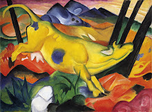
Notkin’s work is definitely my favorite piece in the entire museum because it really struck me. There aren’t a lot of pieces that can really draw a physical reaction out of me like his piece did. I don’t think I’ve ever physically laughed out loud at something that addresses a political controversy. My son also tried to give the piece a kiss when I was holding him up close to it, so we can conclude that he enjoyed it too!
I’ve always been absolutely in love with the idea of visiting art galleries. I’ve been very blessed and fortunate to have grown up in a family that encouraged the study and discovery of art. We’ve always gone to at least one museum on every family trip so that I could explore and learn and get that satisfaction out of seeing something in person that I’ve read about online.
We really enjoyed our visit to the Crocker but it wasn’t all that I’d hoped for. Since I don’t find much intriguing about nudist subjects and representational works, I was a little bored with the main exhibit. Luckily there were a few new, contemporary pieces in the other areas of the museum that I could check out and enjoy. I suppose this all just means that we’ll have to go back in July for the Andy Warhol exhibit! I highly recommend it to everyone, by the way. If anyone would like to join my mom, son, and myself on a trip to the Crocker to check it out, let me know! It’s going to rock!

Friday, June 20, 2008

Two Worlds Collide


The work of Aziz and Cucher definitely has had an enormous impact on my psyche when I think about how digital manipulation has changed each generation, set impossible standards, and has probably been the root of a lot of mental and eating disorders in the world, today. Just from the first images alone that I saw in the “Collision of Two Worlds” lecture, from the Dystopia Series, I was both disturbed and reminded of the lengths that photographers and advertisers have gone to in order to fool the public into trying to achieve some Adonis-like level of perfection.
Aziz and Cucher’s photographs in their Dystopia Series of 1994-95 all touch on the issue of digital manipulation being used to change what people see and therefore what they are influenced by in society. Through the elimination of the eyes and mouths of the figures in their photographs, the viewer is left with the chilling image of a shell of a man or woman that seems to lack a soul of their own. I interpret this as communicating the message that the masses are manipulated into no longer being individuals with hopes and dreams, but instead they have become mannequins with no treasured thoughts of their own. The eyes are a window unto the soul, and in these photos, the soul has been removed. Is there anything left? Was there ever even a soul to being with? These are questions that the viewer may be left with and they remain unanswered no matter how long one stares at the images.
In my opinion, as far as digital manipulation is concerned, there are definitely two sides to the controversy. On the one hand, it can be used very productively in movies. We all loved the jet scene in the most recent Diehard film. We all know that wasn't real, right? Unfortunately, while it can be quite obvious that the Statue of Liberty has not really been covered in ice as in The Day After Tomorrow, it’s not so obvious when the editor of Vogue Magazine takes a model who is already breathtakingly beautiful by societies standards and enhances her… “assets”, nipping and tucking with that magic digital airbrush and molding a very beautiful woman’s picture into something that is so perfect that we, the consumer, place it on the highest pedestal of our daily existence. Then the self-doubt comes into play. How does one look so perfect? What can I do to achieve that kind of perfection? What am I doing wrong right now?
With all of this self-questioning, we seem to miss the bigger picture, and the most important question: Do we know that we’ve been fleeced?

Tuesday, June 17, 2008

My Favorite Painting


When I was seventeen, I discovered my most favorite painting in the world! It is a creation of Franz Marc's and is titled "Yellow Cow". I was in the Guggenheim with my parents and I saw this painting on the wall and absolutely fell in love with it. The cow in this painting is just so happy. She's light-heartedly bounding through a brightly colored world that makes me think of summer in a wilderness before man came along (regardless of the cows domestication.) The first time I saw it, I couldn’t stop laughing. I thought it was silly and fun and that the artist must really love animals and bright colors. It's a painting that never gets old to look at, no matter how many times I see it.
Marc’s artistry focused around the belief in the symbolism of colors. The use of color in his paintings was very arbitrary, using hues in relation to what he meant to communicate through his work as opposed to making his paintings look as realistic as possible. In his color symbolism, Marc believed that different hues represented different genders and their stereotypes. Blue symbolizes masculinity and intellect while yellow represents cheeriness, gentleness, and femininity. Marc’s use of animals such as this happy cow focused around a movement that swept Germany that gave people a “back-to-nature” conviction. Nudist colonies sprang up, living with the land and directly off the land became the status quo for many people. Marc’s work was influenced by the movement and his own philosophy about the “virginal” innocence of animals and their perception of the world around them. He believed they possessed a divinity and truth that guided his work and his depiction of animals.
Franz Marc created “Yellow Cow” in 1911, shortly after his marriage to Maria Frank. Some believe that this lighthearted, joyous creature, painted in yellow, was meant to portray his wife.
The painting, done with an oil paint medium, is bold and highly saturated with color. Oil paints are fantastic for long-term work because of their slow drying process. The paint can be thickly applied for texture in impasto-style work and the colors are wonderfully bold. They can also be thinned out for a really neat translucent appearance.
Franz Marc’s “Yellow Cow” is a wonderful portrayal of all that is good in the world. The animal is a simply pleased one, with few demands and low-maintenance, making it a wonderful example of the simplicity and the perfection that exists in nature.
BLOG LINK:

Friday, June 13, 2008

Thomas Kinkade ... Artist?


I really don’t take one, single stance in either direction regarding the Thomas Kinkade controversy. I feel that his work has definitely lost most of its value with such an over-saturated market, but I still love the images he creates and the feelings that they cause me to have. Personally, I love the winter scenes with the snow-covered cottages in cool hues that are warmed by the lights flickering in streetlamps, candles in the windows, and even car headlights. The worlds in his paintings seem so cozy, I want to be there with a good book and a mug of chai tea.
As a result of the “warm fuzzies” that I get from seeing Kinkade’s paintings, I absolutely understand the “chocolate box art” nickname that Kinkade’s work has received by those who think less of him and I even agree with it. Even with that said, I still enjoy his paintings. I love his use of colors that seem to absolutely glow in the right lighting, as if they were windows onto living, breathing places. My Dad has print of one of his paintings of Old Town Auburn, complete with the big, orange courthouse and the old red and white fire station. The sky appears to have just cleared up after a rain shower, with every surface shimmering and a sweet yellow-orange sunset. His work just seems so real and makes Auburn seem like the absolute Utopia he creates in the painting. I grew up there and the painting brings back a-million-and-one memories from my childhood.
Ultimately, I’m actually pretty defensive of Thomas Kinkade and his work. I love the feeling I get from his paintings. There is absolutely nothing wrong with wanting to create images the evoke feelings of comfort and love. I have yet to hear a decent argument as to why getting these feelings from a piece of art is wrong. What about women’s needlework and tapestries from hundreds of years ago? These pieces are considered “art” yet they’re often just simple designs that weren’t considered anything spectacular in their time. Does something have to be a minimum of two hundred years old in order to be allowed to cause warm-fuzzies?
On the other hand, I also think that Kinkade has DEFINITELY overdone it. He’s put too much out there and really has no secrets left to share. If the allegations by the press and public are true, then I do agree that Kinkade is just another capitalist pig who has taken something beautiful and twisted and manipulated it to suit his own means. The democrat in me thinks that’s horrible, yet the realistic side of me says “that’s life”. In all honesty, I really think it’s ultimately up to the consumer. If people enjoy something, why ruin it for them? Yes, that statement doesn’t work for things like heroine and drunk-driving, but honestly? When has a Kinkade painting ever caused someone to plow into a tree, killing two passengers and maiming a third? Kinkade has so many fans, myself and my family included, so why punish us as well by trying to defame Kinkade’s work and get him out of mainstream America.

Thursday, June 5, 2008

Analyze That!

Well I'm not sure who the artist is or what the title of this painting is, but I absolutely LOVE it! The use of color is fantastic!

The painting is definitely non-representational, not meant to reflect any sense of reality. It really gives the viewer the opportunity to use their imagination and see whatever they want to in the image. The colors are vivid and bold, communicating energy and enlivening the otherwise drab canvas. The energy this painting puts off is very captivating. It agitates me, but at the same time it brightens my day. I am strangely reminded of a hot, summer’s day at the beach.

The artist used a darkened background with darker values of reds and browns, with splotches of black, to help highlight the designs in the foreground. The rich, hot hues of orange and red create that much more contrast for the hues of blue and purple to stand proud in. The painting seems very flat and fixed, yet the artist has applied overlapping to the different objects, perhaps in order to give some life to this strange world. In the lower-right, there is an archway that looks like it could almost be a walkway to go through in order to enter this unusual world.

There isn’t much evidence of implied lines being used to direct the viewer; however, the horizontal and vertical directions of the objects in the painting do draw the viewer to look more intently at the bottom, left quadrant of the painting. I think the artist preferred to use color saturation and intensity as opposed to implied lines to guide the viewer about the image. The brighter and more saturated the hues, the more the viewer is drawn to that area of the painting.

In my own interpretation, I’ve found something that really does interest me in this piece and makes me wish I knew the artist’s name so that I could see more of his or her work. What I find particularly interesting in this painting is the artist’s ability to make things really “pop” out. The complimentary use of colors adds to the affect of the objects being separate entities. Just by using vertical lines of blues, the artist has made both the orange and blue vertical lines seem to be at the very forefront of the world in this painting.

Tuesday, June 3, 2008

Analyze This!!!

Runner at the Goal, Paul Klee